UNSUNG HEROES
Final book project completed within the Visual Communication Department at the School of the Art Institute of Chicago. The concept was conceived during the Occupy Wall Street events that took place in 2012 and production began with printing an arrangement of furniture. Compositions were drawn from observing characteristics of furniture in a social state within the letterpress community. Texts were inspired by each composition and were printed to finish and complete each page.
All pages are printed on a Vandercook press with furniture and moveable type.
Images of this book are published in: Letterpress Luminaries, 2013.
Photography provided by John Dunlevy.
This print took part in a group show at The Hamilton Wood Type Museum this Summer (2015).
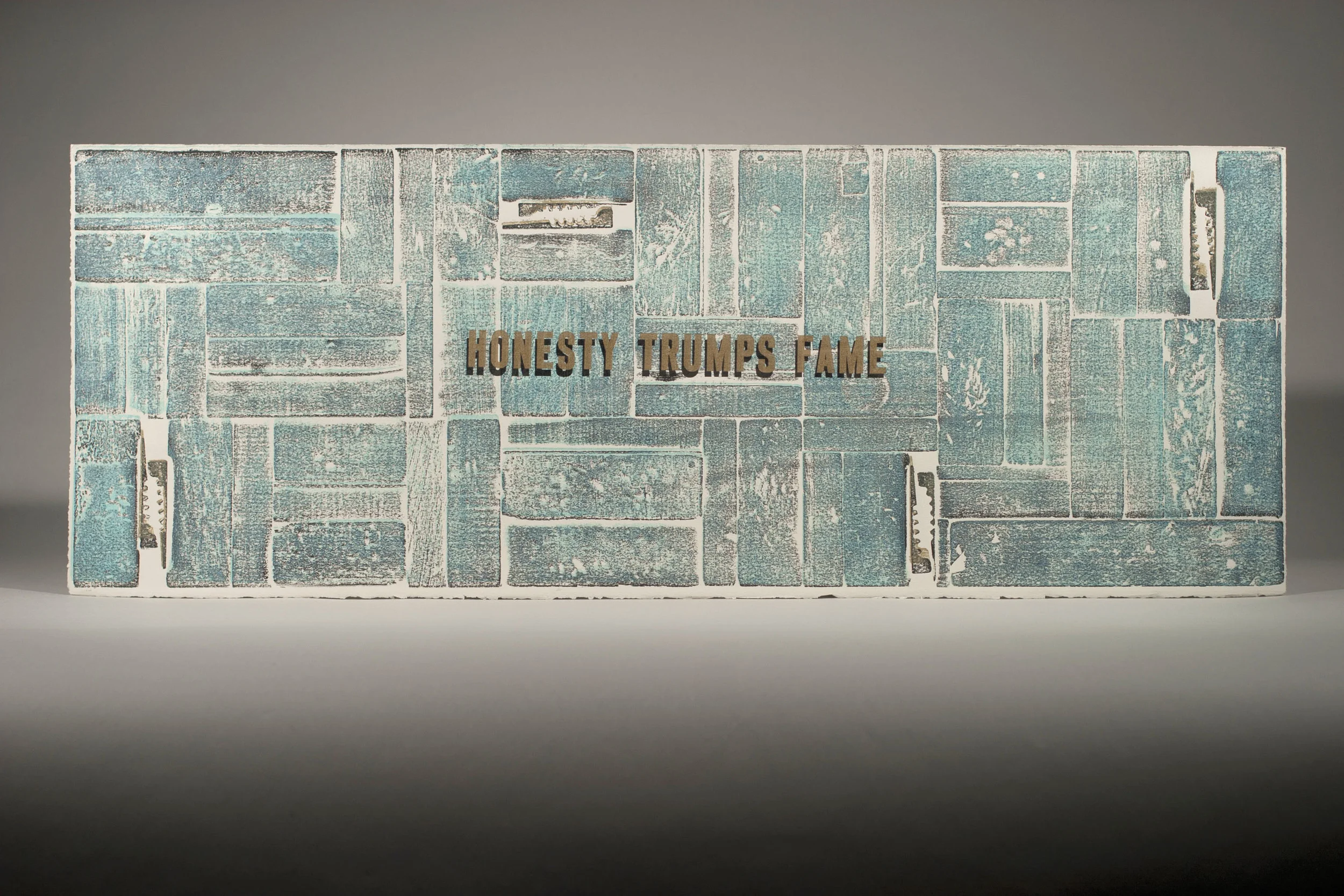
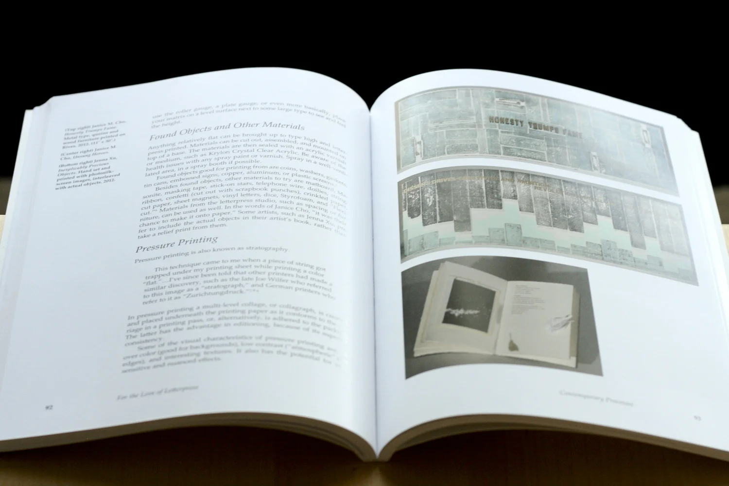
HONESTY TRUMPS FAME
Drawing from the observation of honesty that furniture reveals when printed, this print shows a lock up on a letterpress bed - the most honest arrangement that furniture takes during the letterpress printing process. Exposing the furniture in this way opens a dialogue about the beauty and vulnerability of honesty particularly when imperfection is introduced. Having nothing to hide is an everlasting quality to honesty that exists beyond fame when society is considered. Tension is created with this composition as the text is placed in the center of the print. This decision was made in order to allow readers to curiously investigate what is around the text but to refer back to the text as it cannot be ignored. To some, furniture may seem to seek honesty and type may seem to seek fame.
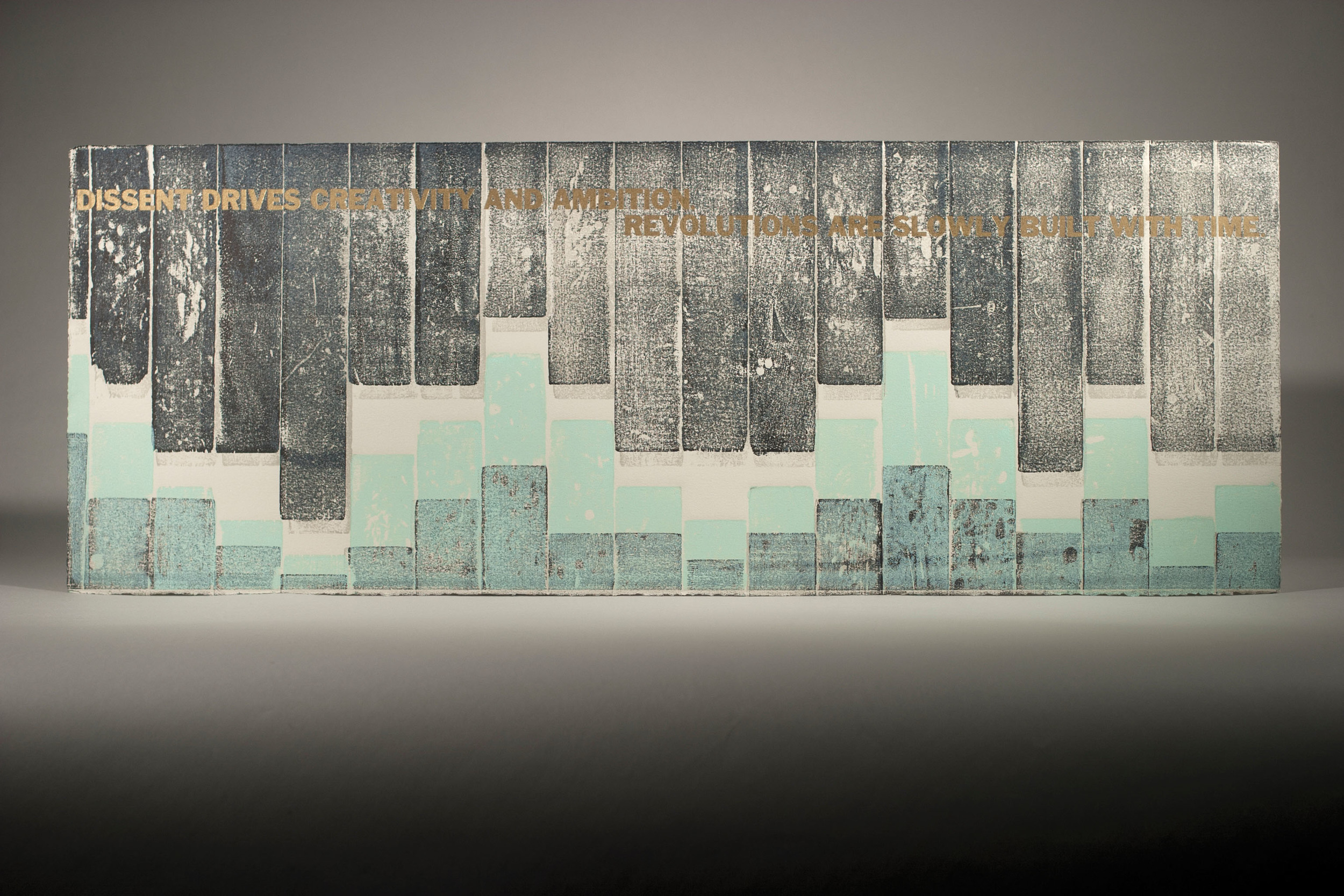
DISSENT DRIVES CREATIVITY AND AMBITION. REVOLUTIONS ARE SLOWLY BUILT WITH TIME.
While furniture is used every time a letterpress print is made, it never makes its mark on paper. The composition of this print is inspired by the idea that furniture experience dissent and suppression on a day to day basis within a letterpress studio - they are used regularly and depended on but taken for granted. This analogy is drawn from working class cultures and movements throughout political history from countries around the world. Text is laid out across the page in order to direct the reader to absorb the moving tension on the lower half of the print. Color is applied to lower portion of the image to suggest progression and a movement towards ownership.
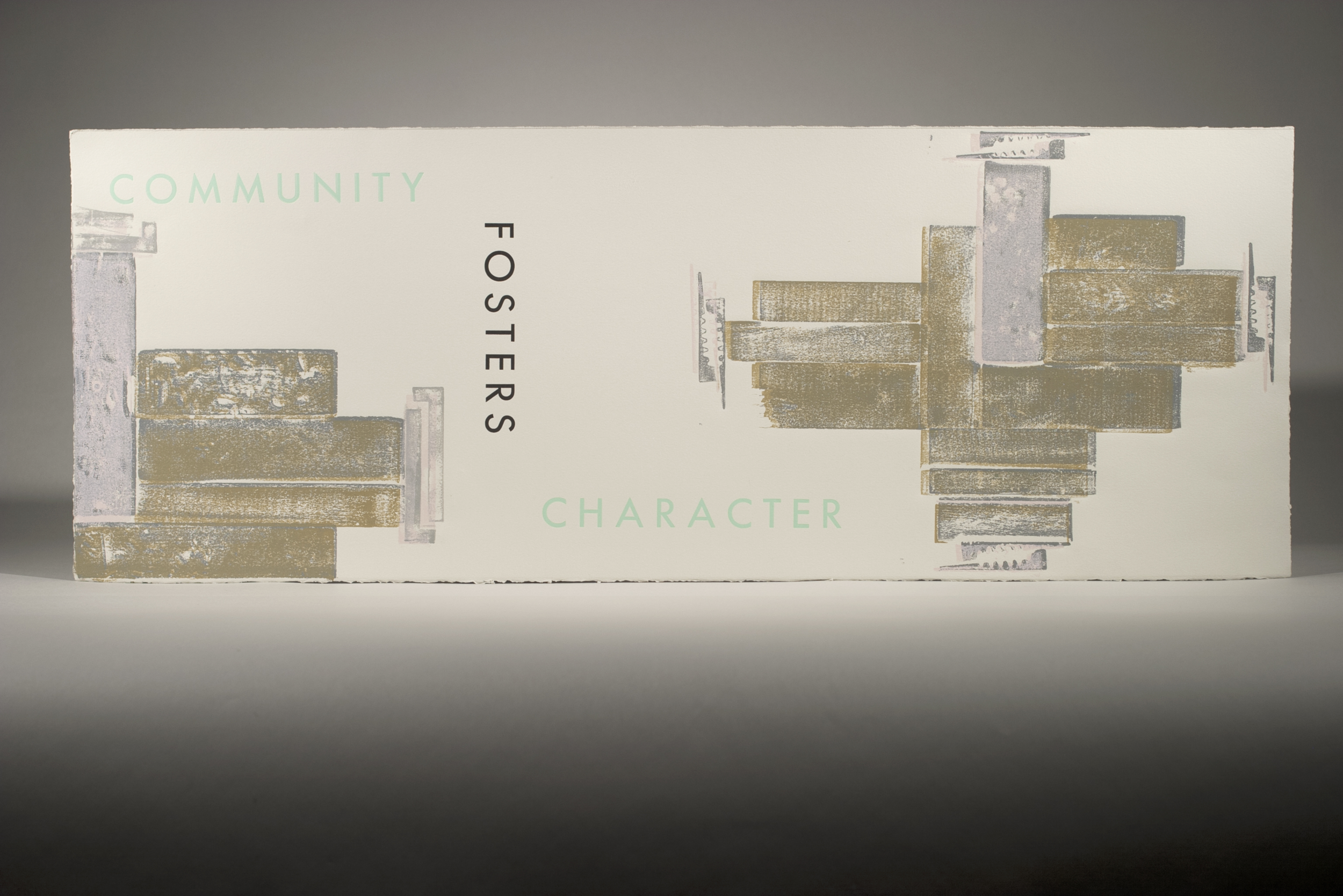
COMMUNITY FOSTERS CHARACTER
In the letterpress studio, furniture is never used alone and they are dependent on each other to perform their duties. Various shapes and sizes are required for each print and like a community, interdependence is necessary for survival. It is also through this interdependence that furniture individually have their own scars - marks of character that hold records of the past driving each piece to be capable of standing on their own. Text is printed in a directive way that first lands a reader's eye to the image on the right and communicates a divide of the two images. While it divides the page, it creates movement for the reader to jump between both images in a figure 8 motion while taking in content of the text.
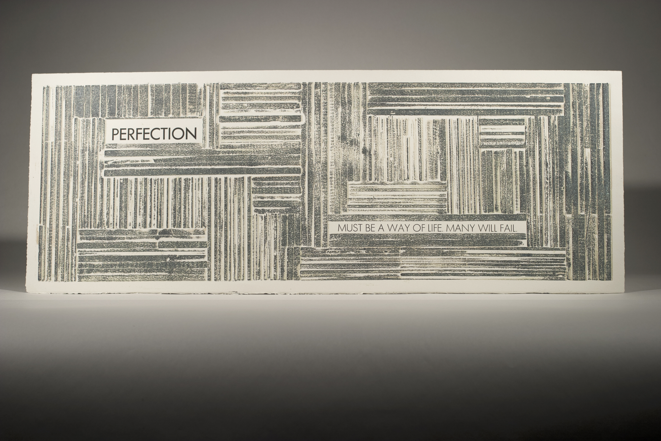
PERFECTION MUST BE A WAY OF LIFE. MANY WILL FAIL.
The perfection of a furniture's measurements is crucial to its survival and with the slightest flaw, the existence of a piece of furniture is determined. This page focuses on the power and importance of reglets within the letterpress furniture community.
Click through Gallery: